

6 February, 2024
Psychology of Colour: Choosing the Right Hue for Your Promotional Mugs
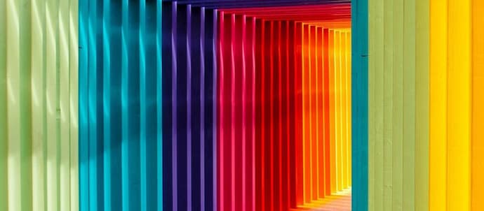
The power of colour is indisputable, influencing everything from our mood to our purchasing decisions. When it comes to promotional products like mugs, the choice of colour is not merely an aesthetic consideration but a psychological one. Brands can harness the psychological impact of colour to resonate with their audience, thereby increasing the efficacy of promotional items. The psychology of colour and how choosing the right hue for your promotional mug can profoundly impact brand perception.
The Role of Colour in Psychology
Colour psychology is the study of how colours affect human behaviour and decision-making. Different colours evoke different emotions and responses. For instance, red is often associated with excitement and passion, while blue symbolises trust and calm. By understanding these associations, brands can select colours that align with their brand values and the message they wish to convey.
How Colour Affects Brand Perception
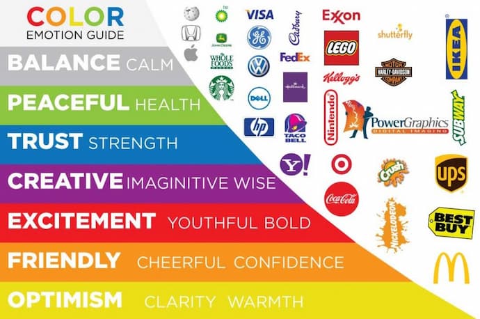
1) Trust and Reliability: Blue
Blue is often synonymous with trustworthiness, reliability, and a sense of calm. In psychology, it's regarded as a stable and dependable colour, often associated with the sea and sky—constants that people find reassuring. It's hardly surprising that numerous financial institutions like banks and insurance companies adopt blue in their branding. The colour blue can send a subtle message of dependability. Blue mugs can serve as a daily reminder to your clientele or staff of the company's commitment to reliable service.
Extended Applications
In a workplace setting, they can instil a sense of unity and trust among team members. For customer-oriented campaigns, it could be used to promote new savings or insurance plans where trust is a key factor.
2) Excitement and Passion: Red
Red is the universal colour of excitement, passion, and energy. It is proven to increase heart rate and grab attention. Therefore, brands looking to make an impact often opt for red. When a customer sips from a Red mug, it invigorates their senses and keeps the brand top-of-mind as youthful and energetic.
Extended Applications
They could be particularly useful at launch events or festivals where you want to create an atmosphere of excitement. They're also excellent for brands linked to physical fitness, adrenaline-pumping activities, or even romantic services like dating apps.
3) Elegance and Luxury: Black or Gold
The richness of black and the lustre of gold are often associated with luxury, exclusivity, and sophistication. These colours command attention and convey a sense of prestige. High-end car manufacturers, luxury fashion labels, and exclusive membership services often use these colours for this reason. A promotional mug in black or gold immediately elevates it from a mere utility item to a product of distinction.
Extended Applications
They could be limited-edition giveaways for top-tier customers or used in premium gift sets. They would be perfectly at home in VIP lounges or at high-end corporate events.
4) Eco-Friendly and Natural: Green
Green is the colour that immediately evokes a sense of natural balance, harmony, and sustainability. It's the hue that most people associate with eco-friendliness and environmental care. Sustainable, organic, or environmentally responsible brands often extensively use this colour in their branding. A Green mug can serve as a constant reminder of the brand's commitment to environmental welfare.
Extended Applications
They could be used as part of a brand's Earth Day campaign or any environmental initiative. They would also fit well in organic cafes or health stores, reinforcing their natural ethos.
5) Femininity and Creativity: Purple or Pink
Purple and pink are deeply tied to creativity, imagination, and often femininity. Purple has a rich history associated with royalty and spirituality, while pink is more universally linked to compassion and love. Brands that deal in artistic or creative ventures or target a predominantly female audience often employ these colours. A Purple or Pink mug can serve as a beacon for those seeking creativity or femininity in the brands they choose.
Extended Applications
They could be perfect for art exhibitions, women-focused events, or creative workshops. They would also be a hit during product launches for beauty or fashion brands that want to highlight their creative edge.
6) Optimism and Cheerfulness: Yellow or Orange
Yellow and orange are warm, inviting colours that project optimism and happiness. Yellow is associated with sunshine, positivity, and intellect, while orange blends red's passion with yellow's cheerfulness. Brands looking to appear friendly, approachable, and cheerful would benefit from using these colours.
Extended Applications
They could be particularly useful for brands focusing on children’s products, educational services, or community events. They would attract attention and promote a sense of happiness and optimism, enriching the brand image.
7) Cleanliness and Simplicity: White
White is often linked with purity, cleanliness, and simplicity. It's a neutral colour that provides a clean slate, often used by brands that want to convey a minimalist, modern aesthetic. Tech companies, skincare brands, and minimalist lifestyle products frequently use white to align with these qualities.
Extended Applications
They could be featured in health and wellness campaigns or minimalist home décor sets. Their neutrality makes them versatile as a canvas for other brand elements like logos or taglines, accentuating the brand message without overpowering it.
Understanding the psychology behind these colours can significantly aid brands in selecting the most appropriate hues for their promotional mugs. Beyond the aesthetic appeal, the right colour choice can invoke the desired emotional response and create a stronger connection between the brand and its audience.
Customising for Your Audience
It's also crucial to consider your target demographic when choosing a colour for your mug. Different cultures have varying interpretations of colour. What's considered positive or attractive in one culture may not be so in another. It's advisable to conduct market research to ensure that your colour choice resonates with your intended audience.
Case Studies: Brands Doing it Right
1) Coca-Cola
The iconic brand Coca-Cola uses red to symbolise excitement, happiness, and celebration. Their red promotional mugs are more than just drinking vessels; they're a portable embodiment of the brand's values. Each time someone sips from one of these, they're subconsciously reminded of the pleasure and festivity that Coca-Cola aims to bring into their lives.
2) Starbucks
Starbucks' use of green aligns with its logo and serves as a nod to its ongoing sustainability initiatives. The colour green symbolises a relaxed and welcoming atmosphere, which Starbucks aims to provide in each of its outlets. The mugs become a take-home extension of the brand’s eco-conscious values and café ambience.
3) Apple
Apple's minimalist white mugs convey much more than just the brand's logo. White is synonymous with simplicity, cleanliness, and modernity—values that are at the core of Apple's design philosophy. These are like a blank canvas, mirroring the brand's focus on providing a user-friendly, intuitive interface across all its products.
4) Nike
Nike often uses black and bold colours to represent strength, determination, and athleticism. Their mugs, often featuring these tones, echo the company's commitment to high performance and its "Just Do It" mantra. They could easily find a home in a gym setting or as a companion during strenuous outdoor activities.
5) BMW
BMW is a brand associated with luxury and engineering excellence. The company often uses black or silver in its branding, colours that evoke a sense of sophistication and technological advancement. A BMW coffee mug would likely follow this colour scheme, serving as a miniature representation of the quality and craftsmanship that go into their automobiles.
6) Lush Cosmetics
Renowned for its commitment to organic ingredients and ethical sourcing, Lush often opts for green or earthy tones in their branding. A promotional mug from Lush would likely incorporate these colours to further hammer home their eco-friendly message. Using such a mug would remind customers of the natural, handcrafted quality of their bath and body products.
7) Adobe
Adobe, a leader in creative software, has a branding that often leans towards red, which represents creativity and passion. A promotional mug from Adobe would carry forward this colour and act as a stimulus for imagination, resonating with the designers and artists who frequently use their software.
8) National Geographic
Famed for its commitment to exploration, science, and education, National Geographic often uses yellow in its iconic rectangular logo. A mug sporting this hue would evoke feelings of curiosity and adventure, inspiring the consumer to think about the world's mysteries, much like the brand's documentaries and articles aim to do.
Understanding the psychology of colours and how brands intelligently apply them in their promotional materials can offer significant insights. Not only do they serve a functional purpose, but they also serve as constant, subtle reminders of what each brand stands for.
Conclusion
The psychology of colour is a fascinating and crucial aspect of brand promotion that, when done correctly, can lead to increased brand recognition and customer loyalty. The choice of colour should not be an afterthought but a carefully planned decision that aligns with your brand values, your target audience, and the message you want to convey. By investing time in understanding the psychological impact of colours, you can significantly enhance the efficacy of your promotional efforts.
The Mugs Only Team